The Net Artworks that I have chosen are all curated from the theme of color. While color is a broad term for artworks, I have chosen five artworks that all use color as the main way to convey the meaning of the work.
From the Rhizome.org archive, I have chosen works from the subpage “HTML COLOR CODES”, all ranging from the beginning of the HTML launch year in 1990, (created in 1980), to the present.
HTML was created by physicist Tim Berners-Lee. It was originally created for researchers to be able to use and share documents. In 1989, Berners-Lee proposed an Internet-based hypertext system. Berners-Lee specified HTML and wrote the browser and server software in late 1990. The first version of HTML was released in 1993. Since then, there have been many different versions of HTML. The most popular version throughout the 2000’s was HTML 4.01, which has since become the standardly used HTML.
HTML color codes are used to recognize different colors when changing the color of web pages, text, and backgrounds. There are 16,777,216 colors that HTML currently recognizes. With this information, it can be concluded that there are nearly endless combinations of colorways that can be used in art, specifically NET art.
HTML color codes are used by the amount of red, blue and green in each color. Each unique color has a unique code, and they are all created by the combination of red, green or blue. For example, the color code for red is #FF0000, which is 100% red, 0% blue and 0% green. Mixtures of colors created different codes that start with letters and end with numbers.
With this in mind, the artists that use HTML color codes to create art take into consideration the different colorways that can go together to create a meaningful and beautiful piece. All of the artworks that I have chosen have the same historical background of learning to use HTML when it first became popular.
On Rhizome.org, the HTML color codes exhibition is explained as follows; “…features a selection of internet based artwork that address the topic of digital color. The central question that the exhibition poses is whether or not artists working with the internet are in fact limited to a “ready-made” color palette, a premise that many artists working with film, photography, and mass produced, standardized paint sets have assumed.” The difference between internet artwork and other types of artwork is that internet artworks use HTML color codes. However, as stated before, there are 16,777,216 different color codes that currently exist in the HTML coding. So, the question that many different artists have posed towards internet artworks, asking if they have a limited color palette of premade colors, is obsolete. Yes, there is a “set color palette”, but there are millions of different colors to choose from. It is similar to how painters mix colors to create new ones, except it is online.
Rhizome.org states, ” The rationale for this question stems from theories of perception that argue that color is a not ready-made object found in a paint set or machine, but rather it is an experience that results from a complex process of light interacting with the retina and human nervous system.” Color is an experience that is slightly different for everyone because of the way that the color reflects into the eye. Red is very slightly different to me than it is to you. So, the different colors that artists use in their works are chosen from what their eyes perceive that color as.
The color wheel also has a large impact on how artists choose what colors to use in relation to each other. Complimentary colors are colors that are directly across from each other on the color wheel, such as yellow and purple. Those colors are the farthest away from each other that causes them to stand out when next to each other and look more vibrant. Some artist choose to use complimentary colors next to each other to make their works pop more and stand out more. Other artist may use colors that are closer to each other on the color wheel to create a more monochromatic aesthetic. These also include the groups of “warm colors” and “cool colors.” An artist might create a cool colored work by using different shades of greens and blues and purples.
Furthermore, there are different types of moods that colors can create in artworks. A popular example of this is Pablo Picasso’s “blue period.” This period lasted from 1901 to 1904. It is called the blue period because he painted mono-chromatically using lots of shades of blue and green. This created a sad and somber mood in his paintings from this period that reflected his depression in life.
Another example of this is using reds to reflect passion, dull yellows to reflect decay or sickness, or greens for ambition or jealousy. While using certain colors certainly does not always reflect a certain mood, some artists do use color in order to get across a feeling. This creates more of a strong resonance to the consumer of the art, and makes them feel the feeling that they are trying to get across. This is, again, the tactic that Picasso used to convey his depression in life through his art.
Getting to the artworks I have chosen, the things that have been explained are all reflected in these pieces. HTML color codes are more than just choosing colors from a selected palette; it can be reflective of the history of HTML coding, conveying a certain feeling or emotion, or simply choosing colors that look appealing together to create a certain type of aesthetic.
The first artwork I chose is by Chris Ashley, created in 2009, Untitled.
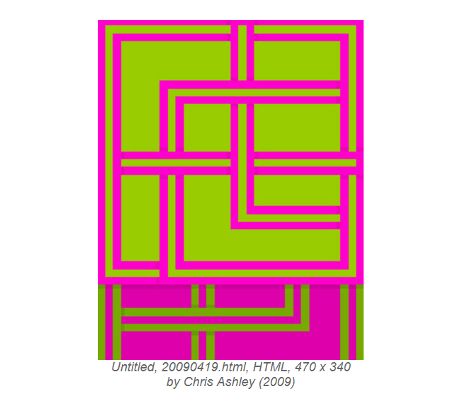
This piece is an example of the artist using complimentary colors to create an artwork that “pops”. Green and pink are opposites on the color wheel, and the use of lines in this piece combined with these colors creates a beautiful juxtaposition.
The second piece that I chose is by Michael Demers, made in 2009, called “Color Field Painting (“Where,” after Morris Louis) Browser Windows”.
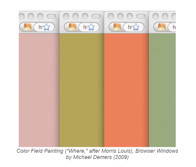
These colors are all soft and more on the pastel side. I think that this piece is extremely interesting because it includes the browser windows that the colors were opened in. It is almost like the artist wanted the consumer to recognize that this is a Net artwork made on the internet because of the blatant insertion of the browser windows.
The next piece I chose is by Owen Plotkin, from 2003, called “firelight (from the Colorbots series)”
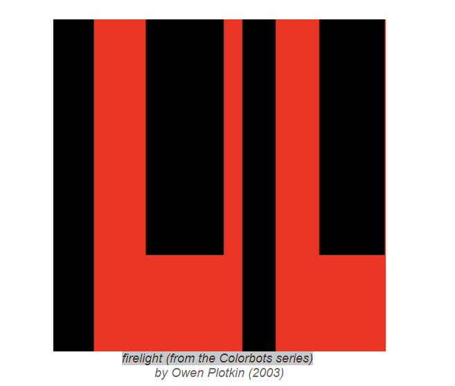
This piece creates a dark and passionate mood through the use of colors. Red and black are commonly associated with darkness, passion or anger. This piece conveys a mood through the use of color and block work.
The next piece is by Morgan Rush Jones, created in 2008, called “Number of ManufacturingIndustriesbyNumberof Product ClassesinanIndustry “.
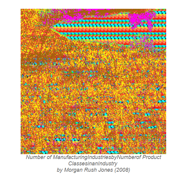
I enjoy this piece because it is a lot more hectic and less simplistic than the others. The use of repetitive dots creates the look of a cluster and chaos. The colors used are also reflective of chaos because there are so many different ones that do not seem to go together.
The next piece is created by Rafael Rozendaal in 2001, called “RGB”.
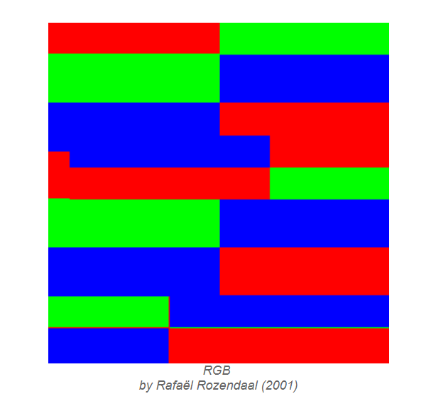
I like this piece because it is a reflection of the raw origins of HTML color coding. It is the exact color codes of red, blue and green, and as I explained before, are the three colors that make up every single other color in the HTML code. It is recognizing those three colors that make up all the other colors.
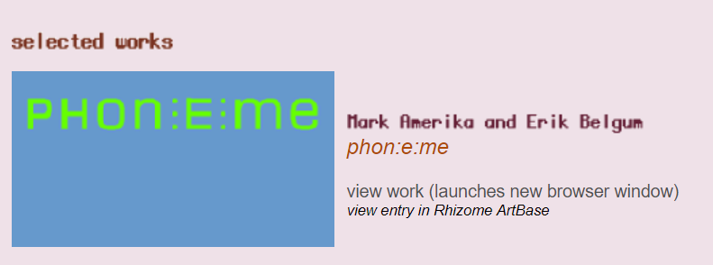
I also chose to include a piece of music that Rhizome.org had to offer. It is by Mark Amerika and Erik Belgum called “phon:e:me”. I chose this piece because not only is the cover art created by HTML color codes, but the music is interesting and beautiful.