Coffee with Moshe Safdie

Alivia Leon

Introduction

Moshe Safdie is an Israeli-Canadian architect that changed the way designers look at urban architecture. Safdie’s architectural career combines out-of-the-box thinking with innovative and effective design. Most notably, and my personal favorite piece of his work, is Habitat 67. In 1967, 29-year-old Safdie created the groundbreaking, innovative “Habitat 67”, located in Montreal, Canada. (Bolz 19). Safdie’s vision was to create the most effective, space-saving living complex possible. The building included 158 concrete blocks, organized in various different ways to create separate, unique apartments.They interlocked, each having a private outdoor patio space, private entrance and interlocking hallways. (Bolz 19). The success of this building led Safdie to continue working on other projects; notably, The Yad Vashem Holocaust History Museum in Jerusalem, the Marina Bay Sands Resort in Singapore, and the National Gallery of Canada in Ottawa. The Yad Vashem Holocaust History Muesum is another incredible and extremely important pieces of his work. As stated on Safdie’s official website, ” The Museum is located on Mount Herzl, the Mount of Remembrance. To preserve the pastoral character of the delicate site and respond to the needs of Yad Vashem, the “body” of the Museum is hidden within the earth, only allowing the elongated central spine to break through the earth and convey a sense of its true scale.” (Safdie Architects 1). This beautiful and important remembrance museum delicately balanced both his architectural talents with the sacredness of the Holocaust and the mountain it was built on. Safdie’s works include this theme commonly; respecting the areas that they are built on while harnessing his creativity into the buildings. His architecture exceeds expectations, taking on incredibly honorable and important jobs with humbling grace, and taking what seems impossible and turning it into reality. Before all of his amazing works, however, Safdie moved to Canada, where his talent for mathematics and art led him to begin studying architecture at McGill University. (Bolz 19). Safdie’s visionary works of architecture and his incorporation of interesting shapes, forms and materials is what makes him stand out from other designers. Safdie takes an idea that seems inconceivable and turns it into an effective, beautiful piece of architecture. 

Object 1
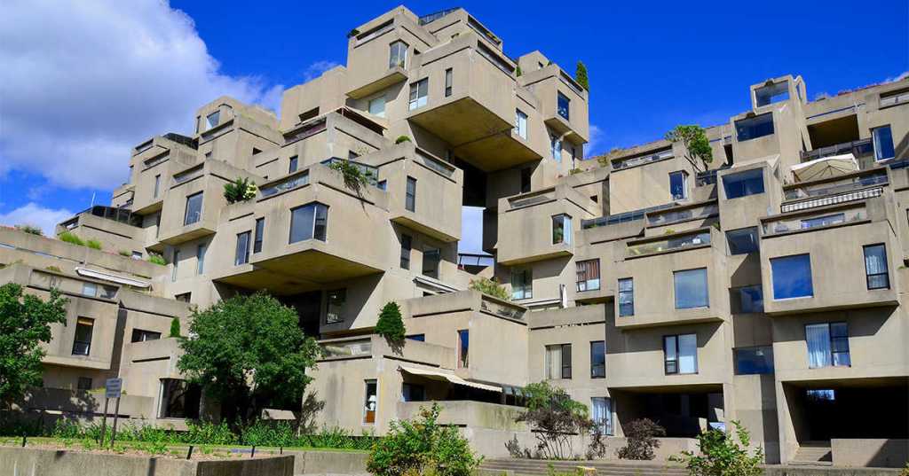
“Habitat 67”. 1967, Moshe Safdie, Montreal, Canada.

Me: What inspired the ideas behind Habitat 67?

Safdie: Well, the design aesthetic itself was very inspired by Legos. I wanted to create the look of interlocking blocks that appear to float without a base structure. However, in regards to Habitat 67’s purpose, I simply wanted to incorporate both the openness of the outdoors and being as space-conscious as possible. Each apartment has its own private outdoor area, and the whole building can house 146 different residences. (Bolz 19-20).

Me: Why did you choose the material that you did?

Safdie: I chose concrete because I wanted the most minimalistic and simple appearance as possible. The concrete blocks were also pre-fabricated, which meant that it would be much easier to create the stacked design of the building. (Bolz 19).

Me: And are you happy with how Habitat 67 came out?

Safdie: Yes! I still own one of the best penthouses in the building.

Object 2:

Yad Vashem Holocaust History Museum. 2005, Moshe Safdie, Jerusalem, Israel.

Me: This museum is massive! What does it include?

Safdie: Being the new version of the pre-existing Holocaust museum, there were a few upgrades. This building includes a Hall of Names, a synagogue, Holocaust art galleries, a learning center, and the newest addition, underground parking and tour bus facilities. (Safdie Architects 1).

Me: What inspired the architectural design of the museum?

Safdie: Well, for every project I consider aspects such as the area it is built on, the building’s significance and the symbolism I want to include in the design. For something as important as the Holocaust Museum, I wanted to honor Mount Herzl and Jerusalem while also including symbolism. That is why the body of the museum is hidden underground; this does not obstruct the mountain it is built on and also symbolizes how “underground” the Holocaust was. (Safdie Architects 1), (MGS Architecture 2).

How do you feel being the architect tasked with designing the incredibly historically significant Holocaust museum? How do you feel that you got to create this work in your home country of Israel?

Safdie: It is immensely important to me. In 1970, I established a Jerusalem branch office and began focusing on rebuilding Jerusalem. This museum was the biggest project that came of that, and it is my greatest achievement. Israel is very important to me, and after creating this museum I worked on the restoration of the Old City, eventually linking the Old and New Cities. (MGS Architecture 2).

Object 3:
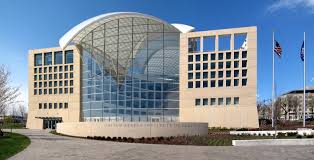
United States Institute of Peace. 2011, Moshe Safdie, Washington D.C. United States.

Me: This is another extremely important work of yours. What was your vision?

Safdie: I simply wanted symbolism to be transformed into architecture. I wanted this building to be drenched in sunlight, which is why windows completely cover it. For me, light completely symbolizes peace, because it has to do with transparency. (Safdie on CBS Sunday Morning, 5:02-5:21).

Me: What personal values of yours are reflected in this work?

Safdie: Every project of mine, whether sublime or ordinary, has critical issues of humanity, of social responsibility. Whether it be a housing facility or the Institute of Peace, each project carries the importance of humanity, and considering the factors that go into it. (Safdie on CBS Sunday Morning, 5:30-5:50).

Me: What are the key features of the Institute of Peace?

Safdie: The windows project daylight into every working space, and they also provide views of the city. The mixture of private offices and large, community space creates a delicate balance between privacy and community, which defines peace for me. It also includes a lattice roof which is nice during the day, but at night, it glows from within to reveal a beacon skylight. (Safdie Architects 2).

Object 4:
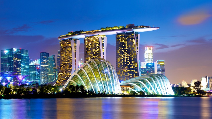
Marina Bay Sands Resort. 2011, Moshe Safdie, Singapore.

Me: This work is much different from your other works. Can you explain your inspiration for this?

Safdie: My architecture is not predictable or repetitive. I like taking each project in stride, making decisions that I think would be best for each individual one. Both geometry and daylight were key factors for this building, which is why there are so many different shapes and forms. Geometry helps me facilitate the more effective and rational construction while still appealing to the eye, and also plays into planning on how much daylight I can maximize. (Bolz 21).

Me: What are your favorite features of this resort?

Safdie: I love that it dominates the skyline of Singapore. It glows colorfully at night while glittering beautifully during the day. One of my favorite parts is the pool, which appears to spill right over the edge of the building. It is 57 stories tall, and I placed the pool right at the top. I had to consider vertigo and wind, but it ended up working out “swimmingly.” (Safdie on CBS Sunday Morning, 0:17-0:40).

Me: And since this is a multi-use resort, what are all the different features that you included?

Safdie: The hotel portion has 2560 rooms in total for maximum guest availability. It also has a large garden capping the towers, an ArtScience museum on the waterfront, a casino, and two theaters. And, of course, in includes a wide array of dining and shopping outlets. (Safdie Arthitects 2).

Object 5:
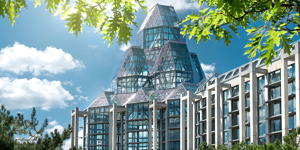
National Art Gallery of Canada. 1988, Moshe Safdie, Ottowa, Canada.

Me: Growing up in Canada, how does it feel to be able to see your architecture displayed around the country?

Safdie: It’s very important to me. I got to be responsible for the design of six of Canada’s principal public institutions, including the National Art Gallery of Canada. I love it because it is where so many people can go to experience the beauty of Canada’s architecture. (MGS Architecture, 3).

Me: How does it work to create public institutions, considering both you, the architect’s, visions, and the design aspects that the city wants?

Safdie: It is actually interesting to explore, because you must consider how the purpose of the building and its design have to work together. The architect and the city need to explore values and choices that will eventually create the final form of the building. You also must consider the public; since it is an art gallery created for the public, you must include design aspects that will work for the general population. (MGS Architecture, 3).

Me: I see your common themes of daylight and geometric shapes are included in this building. Can you explain how these themes play into the individuality of this building?

Safdie: Well, since it is an art gallery, my main focus was to be sure that the artwork displayed was allowed as much daylight as possible. The exhibition halls are where the daylight is focused, and where most of the art is focused. The geometric shapes are mainly to create separate galleries that are connected through bridges and hallways. Both daylight and geometric shapes are most important in the Great Hall, one of the largest sections. It is the principle public and ceremonial space, so daylight should highlight this area, and I allowed it to be the largest and central geometric cluster. (Safdie Architects 1).

Citations

Bolz, Diane M. “Reimagining Urban Architecture.” Moment, vol. 41, no. 2, Mar, 2016, pp. 19-19,21. ProQuest, https://search-proquest-com.proxy.libraries.rutgers.edu/docview/1779873041?accountid=13626

MGS Architecture. “Ar. Moshe Safdie.” Factiva, 31 July 2014, global-factiva-com.proxy.libraries.rutgers.edu/ha/default.aspx#./!?&_suid=15696994815240016515534748739347.

“SafdieArchitects.” Safdie Architects, Safdie Architects, LLC, 2018, http://www.safdiearchitects.com/projects.

Teichner, Martha, director. CBS Sunday Morning: The Architecture of Moshe Safdie: A Man of the World. Safdie Architects, CBS Sunday Morning, 13 Apr. 2014, http://www.safdiearchitects.com/media/cbs-sunday-morning-the-architecture-of-moshe-safdie-a-man-of-the-world.
What is Good Design to Me?

Alivia Leon

Architecture

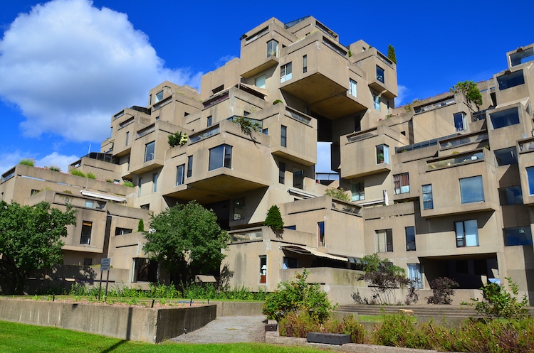
This is “Habitat 67”, located in Montreal, Canada. It is a community living complex desgined by Moshe Safdie. I think this piece of architecture is good design because it is extremely unique, innovative and efficient. The unit is comprised of 146 different apartment complexes ranging from one to eight concrete blocks in various combinations. This piece of architecture wows me because of its similarity in design to Legos. I am amazed by how Safdie was able to make some of the blocks appear to float without a structure underneath supporting them. This building could be good design to me and many others, because of its purpose in encapsulating suburban living with privacy and outdoor space while also conserving square footage. However, it may not represent good design to handicapped individuals, because when reading about this building I did not see that there were any elevators or handicap accessible entrances.

HABITAT 67 BY MOSHE SAFDIE. 1967, MONTREAL.

This building aligns with Deiter Ram’s criteria of what makes good architecture because of its minimalism and simplicity. The structure is made from simple tan concrete, which makes it essentially timeless as shifting trends come and go. I believe that this structure, as long as it stands, will never cease to amaze those who look at it. While this building is essentially timeless, it also encapsulates the trend of minimalism without purposefully doing so.

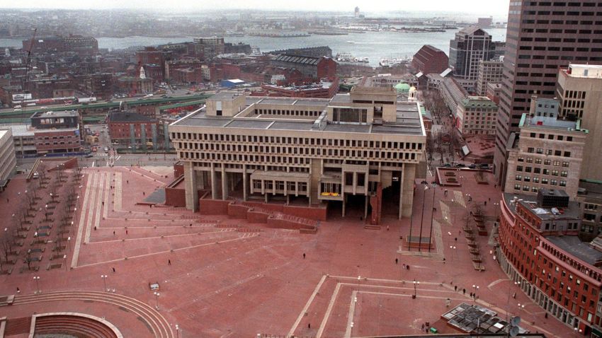
Boston City Hall was constructed during the Brutalist architectural movement in the 1960s. The Brutalist style of architecture became popular because it was a very different style of building that was supposed to open up Boston, not only physically due to its narrow streets, but economically after the 1950s. This building wows me because of how strange the bottom looks with no structural foundation, and how it is built into the red brick of the ground. I think this is good design because the City Council room and the Mayor’s office both project over the red brick plaza, encouraging more intimate public contact during celebrations and ceremonies that were held in the plaza. There is also ample room for foot traffic in and around the building because of the open space around the supporting columns and lack of foundation. I feel as though this building could encourage more public activity because of its placement and open room around the structure.

BOSTON CITY HALL, MICHAEL MCKINNEL AND GERHARD KALLMANN. 1968, BOSTON.

I feel as though this building would align with some of Dieter Ram’s criteria for good design. I do think it fits in with guideline #10, being a design with as little design as possible. This building does not include much decorative architectural aspects and looks as simple as possible, taking its use as City Hall into consideration. This design is also long-lasting, being made mostly of concrete and not needing many structural touch-ups as it ages. However, since this building was created during the Brutalist movement in the 1960s, it is interesting to think about if it is timeless or not. While it is very simplistic and minimal, made mostly of tan concrete, the style is very much characterized as Brutalist, which can make it appear aged as the years go on.

Interiors/Interior Design

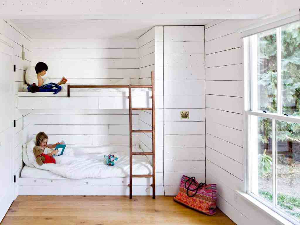
Jessica Helgerson bought a tiny home in Oregon in 2008 and decided to design the most effective and space-saving interior possible. The home is only 540 square feet, and Helgerson designed the interior with almost all recycled or re-purposed items. This children’s bedroom is exactly what I consider to be my personal design aesthetic; minimalistic with a vintage feel. I am wowed by the look of the white wood paneled walls because of their antiqued finish, and I love the pull out closet shown on the right of the bunk beds. I think that this room would represent good design to almost anyone who is trying to save space or be as compact with their living space as possible. I see a possibility with saving even more space in this room if there was a small attic in the ceiling to store the children’s toys, books etc. The possibilities are endless with being thrifty and saving space, and being even more environmentally friendly. I think that Helgerson did an incredible job on taking a tiny, closet-sized room and turning it into a functional and aesthetically pleasing children’s bedroom.

JESSICA HELGERSON, “TINY HOME” CHILDREN’S BEDROOM. 2008, OREGON.

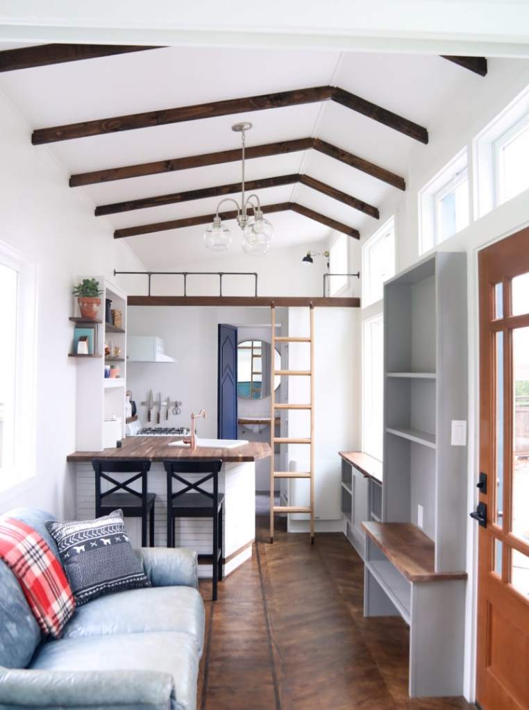
This is an interior of a “living area”, created by Matt Impola, founder of Handcrafted Movement. It includes a kitchen, living room and loft area. He began working on this small house as a “weekend project”, and has since found his love of decorated tiny spaces with environmentally friendly, recyclable, and extremely functional items. His trick for this room was in the flooring; he used one-inch thick ply wood to floor this home, leaving him a few extra inches of room for furnishing and extra items than if he used regular flooring. I think this is amazing design because he pays extreme attention to details that all influence how effective his use of space is. This interior wows me because of how gorgeous it is, and how everything in this space is reused and re-purposed. Similar to the other tiny home, this interior is good design to anyone who is trying to live a more minimalistic life and conserve space. However, the loft included in this space uses a ladder to access it, which would be a problem to handicapped individuals.

MATT IMPOLA, “SPACIAL CONSERVATION” LIVING AREA. ~2016, CALIFORNIA.

Both of these interior designs would align with Dieter Ram’s guidelines of good design. They are extremely innovative, taking a new approach on spacial conservation. They are both useful an aesthetically pleasing. Both are thought out to the last detail, whether it be Jessica’s pull out closet or Matt’s one inch floors. They are also very environmentally friendly, using recyclable and reused items to furnish and decorate.

Fashion

Costello and Tagliapietra’s New York Fashion Week Fall/Winter 2012 collection screams good design because of how their clothing was produced. The two designers use AirDye to create the colors and patterns on their clothing. AirDye is a sustainable and environmentally friendly technology that uses water-free dyeing, saving huge amounts of energy and water. This is amazing design because not only do the clothes look great, but they were produced using extremely eco-friendly technology. The fashion industry wastes incredible amounts of water and energy when producing items. This is good design to everyone because being environmentally conscious is something that impacts the entire world positively. This line of fashion also represents my personal design aesthetic because, fashion wise, it is very flowy, and 60s inspired. It also environmentally aligns with my personal design aesthetic because I love anything that is eco-friendly.

Costello Tagliapietra, NYFW Fall/Winter 2012, California.

“I AM NOT A VIRGIN” jeans started when founder Peter Heron realized that millions of tons of denim scraps and plastic bottles were tossed into landfills each year. He decided to create a brand that created clothes from fabric scraps and recycled bottles. I think that this is great design because it is extremely innovative and environmentally friendly. Recycling extra fabric from manufacturers and thrown away bottles and turning them into new clothes is an amazing idea. I see infinite possibilities in this brand, because if they are already using fabric scraps and bottles successfully, you can imagine all of the other recyclable materials that could come into play.

I AM NOT A VIRGIN/PETER HERON, BOTTLE RECYCLED JEANS. 2013, NEW YORK.

Both of these fashion examples align with Dieter Ram’s guidelines of good design. They are aesthetically pleasing, which is one of the most important aspects of fashion. They are extremely environmentally friendly, which is their main selling point. They are also long lasting, not in the way of the specific garment will last forever, but in the way that recycling goods is something that will last forever.

Graphic Design

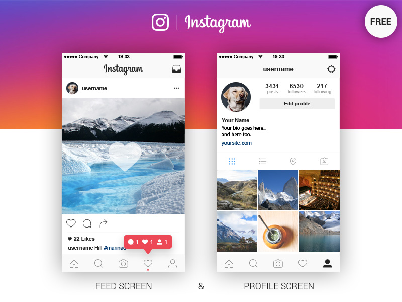
I chose the graphic design aspect of the app Instagram. The layout and design of Instagram puts the emphasis on the user instead of the app as a brand. Kevin Systrom’s design of the “like button”, the tabs on the bottom and the layout of the feed and profile are all essential aspects to why Instagram is so popular. The design is innovative because it was a brand new approach to social media that focused on photos. While the layout of the app has changed since the launch in 2010, the base features remain the same; the like button, the icons that represent the tabs, and the profile screen. This is good design because it encourages users to produce content, rather than only consume brand-created content. I think this is good design to everyone because anyone is able to create content on Instagram. The design aesthetic is simplistic and minimal, which aligns with my personal design preference.

Instagram, Kevin Systrom. 2010, USA.

The McDonald’s “M” logo was created by Jim Schindler in 1962. Since then, the slogan was coined, but the classic “M” logo has stayed the same. This is good design to me because it is timeless and recognizable. Even today in 2019, the simple “M” makes everyone worldwide think, “McDonald’s”. The design of this logo has made a huge impact on McDonald’s as a brand and people worldwide. I enjoy the design aesthetic because they are consistent with their color use of red and yellow, and it is very simple yet recognizable.

McDonald’s, Jim Schindler. 1962, USA.

Both of these examples of graphic design align with Dieter Ram’s guidelines of good design, but in different ways. Instagram is “as little design as possible”, not focusing on creating loud graphics for the brand, but focusing on being user-friendly and accessible. It also makes the product, Instagram, understandable, as its interface is very simple. McDonald’s use of graphic design is also simplistic, however the focus is on being long lasting. The logo is timeless and continues to be recognizable to this day. It is also honest. Ram says that good design should be honest and should not make a product seem more innovative or valuable than it really is. I think McDonald’s does a great job of this because its logo simply says, “I’m lovin’ it.” It is sold to the consumer at face value, simply saying, “our food is good.”

Product Design

The Microsoft Surface represents good design to me because of its innovative design and user friendly features. The Surface includes a touch screen with a detachable keyboard, so it can be used as a laptop or as a tablet. It also includes a pressure-sensitive touch pen, which can be used instead of typing using a pop up box where you can write the words you want to type, and the computer translates them to typeface for you. I think that this is good design for everyone because there are features that are inclusive for any way you want to use the product. Braille keyboards, Sticky Keys, and voice-reading options are available for individuals with disabilities. This object wows me with how innovative and inclusive it is, creating a very simple and easy user-friendly product.

Microsoft Surface, Microsoft. 2012, Produced in Taiwan.

I think Fitbit is an amazing example of good design. Fitbit is a fitness bracelet that tracks things like your total steps, heart rate, breathing, etc. Fitbit is different than the rest of fitness trackers because it gives you personal reminders to get moving, calculates daily goals using your personal statistics, and gives on screen guided workouts. I think this is good design to everyone because it is customizable and caters to your personal needs. You can give it information such as height, weight, gender, personal goals, and even disabilities, which are all taken into account when creating your personal goals. It is also aesthetically pleasing because it is small and can be worn as a watch, and it does not get in your way of other daily activities.

Fitbit, James Park and Eric Friedman. 2007, California.

Both of these products align with Dieter Ram’s guidelines of good design. They are both aesthetically pleasing and easy to use. They are also both honest; they do not try to promise the consumer something that they cannot provide. They are thorough to the last detail, the Surface thinking about inclusivity and providing a user-friendly database, and the Fitbit thinking about customization and personalization.

Which Rutgers School Helps Low Income Students More?

Alivia Leon – Rutgers Financial Aid for Low Income Students

Rutgers University-New Brunswick, and Rutgers University- Camden, are two popular choices when students are searching for which school provides better financial aid. The more populated and popular choice-Rutgers New Brunswick- actually offers significantly less financial aid than Rutgers-Camden.

Image result for rutgers university graphic

https://www.animationcareerreview.com/articles/rutgers-state-university-new-jersey-art-electronic-arts-and-graphic-design-programs-profile

When looking at the two comparatively, Rutgers University New Brunswick is the school with less financial aid options for low income students.

In 2014, there was 30% Pell grants awarded to low income students, while Camden offered 48.1%. (https://projects.propublica.org/colleges/compare?id=186380,186371).

This is a huge difference when it comes down to the size of the schools. Rutgers University New Brunswick is far larger than the Camden campus, yet they award less to low income students.

When interviewing students from Rutgers-New Brunswick, I found that some struggled with financial aid while others did not as much. While they might be considered “average” students, the varying amount that they pay seems to be random.

Image result for student loan photo

http://www.gocollege.com/financial-aid/student-loans/federal/government-student-loans.html

Samantha Matthews, a sophomore at Rutgers University New Brunswick, struggles with her student financial aid. She was not awarded any money in grants, although she was a top student at her high school, and had been under the impression that she would be getting financial aid. She continues to pay full tuition. She states, “Succeeding in high school definitely does not guarantee money in college.”

On the other hand, Julia Gronowska, a junior at Rutgers University New Brunswick, was awarded a lot of money in grants and financial aid. She is enrolled in the honors program, which generally awards a lot of money. She states, “The honors program is really small, but it does have big rewards.”

A podcast by Brentin Hess on finding your way out of student loans.

Michelle Currieri, another junior at Rutgers University, had the same grade range as Gronowska. However, Currieri was not awarded any money whatsoever. Both Gronowska and Currieri are white, they both have the same grades, and both are in state, however were given different amounts of money.

On average, low income students at the New Brunswick campus paid $11,953 compared to $7,827 at the Camden campus.

Furthermore, the discount off total cost at the New Brunswick campus was 58%, while the Camden campus offered 67%.

These statistics are even more baffling when looking at the non repayment rate after graduation.

Rutgers University New Brunswick and Rutgers University Camden both have a non repayment rate of 31.9%. How is this possible when the rates for low income students are so drastically different?

The difference comes down to the difference in minorities in each school. New Brunswick has a white population of 43.3%, and a black population of 7.5%. Camden has a white population of 55% and a black population of 16.5%.

Rutgers Students Become Alumni: 2019 Commencements

Alivia Leon

Students of all of Rutgers University’s campuses; New Brunswick/Piscataway, Camden and Newark, are preparing for graduation as this spring semester comes to a close. The ceremonies will take place on May 19 for New Brunswick Campus, May 22 for Newark Campus, and May 22-23 for Camden Campus. The New Brunswick Commencement will take place at High Point Stadium in Piscataway, New Jersey. The Newark Commencement will take place in the Prudential Center in Newark, New Jersey. The Camden Commencement will take place at the BB&T Pavilion in Camden, New Jersey.

Image result for high point stadium for graduation

https://chrispedota.com/p289233963/h20592522

During the New Brunswick Commencement, speakers Devin and Jason McCourty, Super Bowl champions, philanthropists, and Rutgers alumni, will receive honorary doctorates of humane letters degrees and will address graduates at the 2019 University Commencement.

At the Newark Commencement, speaker Dorothy Roberts, a global scholar, law professor, and social justice activist, will receive an honorary doctor of laws degree and will also deliver the Rutgers University–Newark keynote address.

During the Camden Commencement, speakers Merck CEO Kenneth Frazier and Former Acting U.S. Solicitor General Neal Katyal, will receive an honorary doctor of laws degree and will also deliver the keynote address to Rutgers University–Camden’s Class of 2019.

New Jersey Governor Philip Murphy will also be receiving an honorary doctor of laws degree from Rutgers university.


https://vimeo.com/329786337

These Commencements are mandatory attendance. A supplementary convocation is also a mandatory event that is hosted by each school and offer their own distinctive traditions including special speakers, ceremonies, and student citations. Some convocations require tickets.

On the other hand, the commencements do not require tickets to enter the venue for graduation.

To park on New Brunswick campus on Sunday, May 19, Commencement Parking Hangtags are required. Hangtags are available for purchase through May 1 at 10 a.m.

Rutgers 249th Anniversary Commencement

https://commencement.rutgers.edu/ceremonies/rutgers-university-commencement

Billboard Music Awards

Alivia Leon

The Billboard Music Awards is set to be on Wednesday, May 1 of 2019. The ceremony will be held at the MGM Grand Garden Arena in Las Vegas.

It will air live on NBC, hosted by Pop Singer Kelly Clarkson.

It is claimed to be music’s #1 night, according to The Billboard Music Awards’ twitter. (https://twitter.com/BBMAs/status/1118545906469490689)

Image result for billboard music awards 2019
Photo Credits: https://deadline.com/2019/02/kelly-clarkson-host-2019-billboard-music-awards-nbc-1202567459/

The list of Top Artists for the 2019 Awards include: Cardi B, Drake, Ariana Grande, Post Malone and Travis Scott, According tohttps://www.billboard.com/articles/news/bbma/8505581/billboard-music-awards-2019-nominations

A playlist of this year’s Billboard Top 100 was created on Youtube to give fans a peek into what they will see this year. https://www.youtube.com/playlist?list=PL4o29bINVT4F0TEN0-NHJ9HVT8csWNtim

Also, Pop Star of BTS’ Jimin Breaks has broken the Soundcloud Record for the biggest 24 hour debut, according to billboard.com. https://www.billboard.com/articles/business/streaming/8492211/bts-jimin-promise-soundcloud-24-hour-record-streaming

A listen to that could be found here on Soundcloud.com: https://soundcloud.com/bangtan/firstjiminpresent

Image result for billboard music awards 2019 gif
https://www.billboardmusicawards.com/gif-wall/

Net Art Exhibition: HTML Color Codes

The Net Artworks that I have chosen are all curated from the theme of color. While color is a broad term for artworks, I have chosen five artworks that all use color as the main way to convey the meaning of the work.

From the Rhizome.org archive, I have chosen works from the subpage “HTML COLOR CODES”, all ranging from the beginning of the HTML launch year in 1990, (created in 1980), to the present.

HTML was created by physicist Tim Berners-Lee. It was originally created for researchers to be able to use and share documents. In 1989, Berners-Lee proposed an Internet-based hypertext system. Berners-Lee specified HTML and wrote the browser and server software in late 1990. The first version of HTML was released in 1993. Since then, there have been many different versions of HTML. The most popular version throughout the 2000’s was HTML 4.01, which has since become the standardly used HTML.

HTML color codes are used to recognize different colors when changing the color of web pages, text, and backgrounds. There are 16,777,216 colors that HTML currently recognizes. With this information, it can be concluded that there are nearly endless combinations of colorways that can be used in art, specifically NET art.

HTML color codes are used by the amount of red, blue and green in each color. Each unique color has a unique code, and they are all created by the combination of red, green or blue. For example, the color code for red is #FF0000, which is 100% red, 0% blue and 0% green. Mixtures of colors created different codes that start with letters and end with numbers.

With this in mind, the artists that use HTML color codes to create art take into consideration the different colorways that can go together to create a meaningful and beautiful piece. All of the artworks that I have chosen have the same historical background of learning to use HTML when it first became popular.

On Rhizome.org, the HTML color codes exhibition is explained as follows; “…features a selection of internet based artwork that address the topic of digital color. The central question that the exhibition poses is whether or not artists working with the internet are in fact limited to a “ready-made” color palette, a premise that many artists working with film, photography, and mass produced, standardized paint sets have assumed.” The difference between internet artwork and other types of artwork is that internet artworks use HTML color codes. However, as stated before, there are 16,777,216 different color codes that currently exist in the HTML coding. So, the question that many different artists have posed towards internet artworks, asking if they have a limited color palette of premade colors, is obsolete. Yes, there is a “set color palette”, but there are millions of different colors to choose from. It is similar to how painters mix colors to create new ones, except it is online.

Rhizome.org states, ” The rationale for this question stems from theories of perception that argue that color is a not ready-made object found in a paint set or machine, but rather it is an experience that results from a complex process of light interacting with the retina and human nervous system.” Color is an experience that is slightly different for everyone because of the way that the color reflects into the eye. Red is very slightly different to me than it is to you. So, the different colors that artists use in their works are chosen from what their eyes perceive that color as.

The color wheel also has a large impact on how artists choose what colors to use in relation to each other. Complimentary colors are colors that are directly across from each other on the color wheel, such as yellow and purple. Those colors are the farthest away from each other that causes them to stand out when next to each other and look more vibrant. Some artist choose to use complimentary colors next to each other to make their works pop more and stand out more. Other artist may use colors that are closer to each other on the color wheel to create a more monochromatic aesthetic. These also include the groups of “warm colors” and “cool colors.” An artist might create a cool colored work by using different shades of greens and blues and purples.

Furthermore, there are different types of moods that colors can create in artworks. A popular example of this is Pablo Picasso’s “blue period.” This period lasted from 1901 to 1904. It is called the blue period because he painted mono-chromatically using lots of shades of blue and green. This created a sad and somber mood in his paintings from this period that reflected his depression in life.

Another example of this is using reds to reflect passion, dull yellows to reflect decay or sickness, or greens for ambition or jealousy. While using certain colors certainly does not always reflect a certain mood, some artists do use color in order to get across a feeling. This creates more of a strong resonance to the consumer of the art, and makes them feel the feeling that they are trying to get across. This is, again, the tactic that Picasso used to convey his depression in life through his art.

Getting to the artworks I have chosen, the things that have been explained are all reflected in these pieces. HTML color codes are more than just choosing colors from a selected palette; it can be reflective of the history of HTML coding, conveying a certain feeling or emotion, or simply choosing colors that look appealing together to create a certain type of aesthetic.

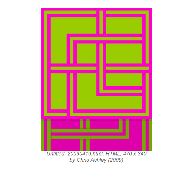
The first artwork I chose is by Chris Ashley, created in 2009, Untitled.

This piece is an example of the artist using complimentary colors to create an artwork that “pops”. Green and pink are opposites on the color wheel, and the use of lines in this piece combined with these colors creates a beautiful juxtaposition.

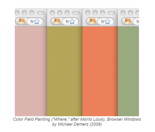
The second piece that I chose is by Michael Demers, made in 2009, called “Color Field Painting (“Where,” after Morris Louis) Browser Windows”.

These colors are all soft and more on the pastel side. I think that this piece is extremely interesting because it includes the browser windows that the colors were opened in. It is almost like the artist wanted the consumer to recognize that this is a Net artwork made on the internet because of the blatant insertion of the browser windows.

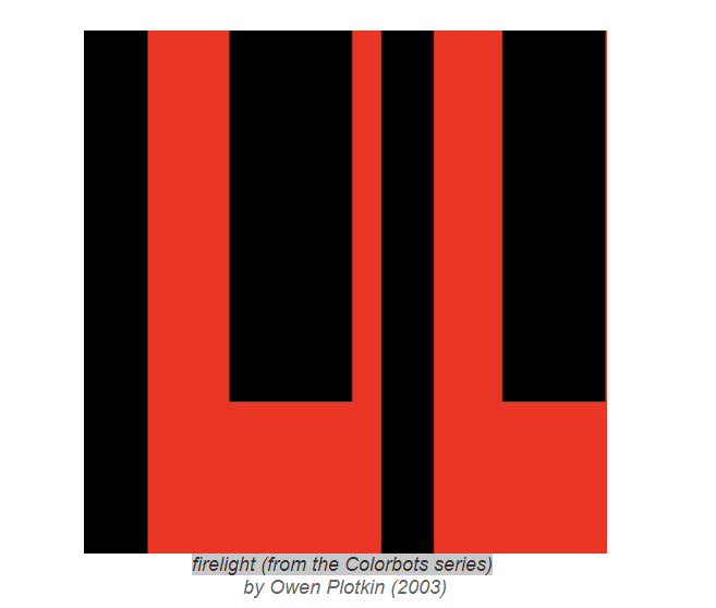
The next piece I chose is by Owen Plotkin, from 2003, called “firelight (from the Colorbots series)”

This piece creates a dark and passionate mood through the use of colors. Red and black are commonly associated with darkness, passion or anger. This piece conveys a mood through the use of color and block work.

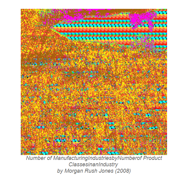
The next piece is by Morgan Rush Jones, created in 2008, called “Number of ManufacturingIndustriesbyNumberof Product ClassesinanIndustry “.

I enjoy this piece because it is a lot more hectic and less simplistic than the others. The use of repetitive dots creates the look of a cluster and chaos. The colors used are also reflective of chaos because there are so many different ones that do not seem to go together.

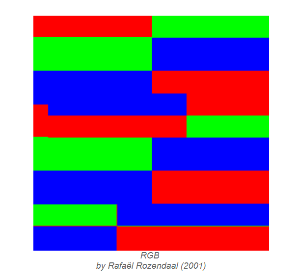
The next piece is created by Rafael Rozendaal in 2001, called “RGB”.

I like this piece because it is a reflection of the raw origins of HTML color coding. It is the exact color codes of red, blue and green, and as I explained before, are the three colors that make up every single other color in the HTML code. It is recognizing those three colors that make up all the other colors.

I also chose to include a piece of music that Rhizome.org had to offer. It is by Mark Amerika and Erik Belgum called “phon:e:me”. I chose this piece because not only is the cover art created by HTML color codes, but the music is interesting and beautiful.

http://phoneme.walkerart.org/launch.html

Practice Lead for Writing for Media

Los Angeles County Museum of Art

The Los Angeles County Museum of Art has cleared its biggest hurdle to erecting a radical new building by the Swiss architect PE ter Zu MO ther that represents one of the country’s most ambitious museum transformations.

https://www.dezeen.com/tag/peter-zumthor/

Walking Tour of the Los Angeles County Museum

The county board of supervisors voted Tuesday to approve the current plan and release $117.5 million in taxpayer funding for it, despite last-minute entreaties from some art and architecture critics who urged the board to vote against the project.

The museum’s director, MI kel GO van, in turn, took to the Opinion page of The Los Angeles Times to present his case.

https://en.wikipedia.org/wiki/Michael_Govan

Image result for los angeles county museum

AUDIO VERSION:

The Los Angeles County Museum of Art has cleared its biggest hurdle to erecting a radical new building by the Swiss architect PE ter Zu MO ther that represents one of the country’s most ambitious museum transformations//


The county board of supervisors voted Tuesday to approve the current plan and release 117.5 million dollars in taxpayer funding for it/ despite last-minute entreaties from some art and architecture critics who urged the board to vote against the project//

The museum’s director/ MI kel GO van/ in turn/ took to the Opinion page of The Los Angeles Times to present his case///

Pink Floyd vs. The Beatles

Pink Floyd and The Beatles are both two of my absolute favorite bands. I thought it would be interesting to compare and contrast the two and learn why I love both of them so much.

Image result for pink floyd members
https://www.google.com/url?sa=i&source=images&cd=&cad=rja&uact=8&ved=2ahUKEwjNhsCZpcHhAhVnUt8KHcsqBIgQjRx6BAgBEAU&url=https%3A%2F%2Fultimateclassicrock.com%2Fpink-floyd-facts%2F&psig=AOvVaw16DMDyNcBejVP-kKeIPxYj&ust=1554840185372774

Image result for the beatles
https://www.google.com/url?sa=i&source=images&cd=&cad=rja&uact=8&ved=2ahUKEwjK1PCopcHhAhWKY98KHUTSDeUQjRx6BAgBEAU&url=https%3A%2F%2Fwww.rollingstone.com%2Fmusic%2Fmusic-news%2F50-years-of-rubber-soul-how-the-beatles-invented-the-future-of-pop-59132%2F&psig=AOvVaw2qcKX3aTyezyNxxO12lDzR&ust=1554840215253282

I love them both, and they are both four male members who harmonize and sing together to create art in music. They are also both “old” bands, established in the 70s and 80s but still having influence to this day because of their beauty.

https://soundcloud.com/anchia-mena/sets/the-beatles-and-pink-floyd

This person on soundcloud crated a playlist with both the Beatles and Pink floyd songs. They also obviously love them both and see the similarities in them.

They both use harmonization in their voices, moreso the Beatles. The sound of four male voices together in different pitches creates a beautiful symphony of sound.

This video is amazing. It is Roger Waters, a member of pink floyd, talking about the Beatles. Seeing both my favorite bands interacting is so cool. Obviously, Pink floyd was later than the Beatles, so the band was able to reflect on the music of the Beatles.

Music for Me in General

To me, music is my favorite way to consume art. I personally love creating art like drawing, writing, painting and fashion, but my favorite type of art to consume is music. I am not musically talented, so I can appreciate the work and artistry that goes into making music.

Image result for music gif
https://www.google.com/url?sa=i&source=images&cd=&cad=rja&uact=8&ved=2ahUKEwj8np-oo8HhAhXKct8KHTogCPoQjRx6BAgBEAU&url=https%3A%2F%2Fgiphy.com%2Fexplore%2Fmusic&psig=AOvVaw2I_WwR0v2CUUYvbQWy63UB&ust=1554839670006091

Music for me is a way to relax or get into a certain type of mood.

I listen to so many genres of music, but my favorites are rock, alternative rock, rap, and remixes. I listen to rock and alternative rock to feel nostalgic and relaxed. I listen to rap to get myself into a better and more motivated mood. I listen to remixes and more chill music to relax and rewind from my day.

I found this song from a very unknown artist on soundcloud. This instrumental song makes me feel happy and very relaxed. The beat and overall production of it is beautiful and I love supporting new artists.
This remix from youtube is perfect for warm weather because it puts me into a summery and happy mood.

DAMN. The Album

By Kendrick Lamar

I specifically love the album DAMN. by Kendrick Lamar because he put so much creativity and effort into it. If you listen to it straight from front to back it tells an entire story, which I think is art.

Image result for kendrick lamar damn
https://www.google.com/url?sa=i&source=images&cd=&cad=rja&uact=8&ved=2ahUKEwiuqcLBosHhAhVrU98KHRFlCGUQjRx6BAgBEAU&url=https%3A%2F%2Fen.wikipedia.org%2Fwiki%2FDamn_(Kendrick_Lamar_album)&psig=AOvVaw3BDjAJZRDgJzMecxN4MmbH&ust=1554839401824869
This comes from a playlist on youtube with the full album. This song is called LOYALTY. I think that it is one of the more relaxed songs on the album, which I love.

This song from Soundcloud is called XXX. It is one of my favorite songs from the album because it is a juxtaposition between happiness and sadness, which is a beautiful thing.
Design a site like this with WordPress.com
Get started