Alivia Leon
Architecture
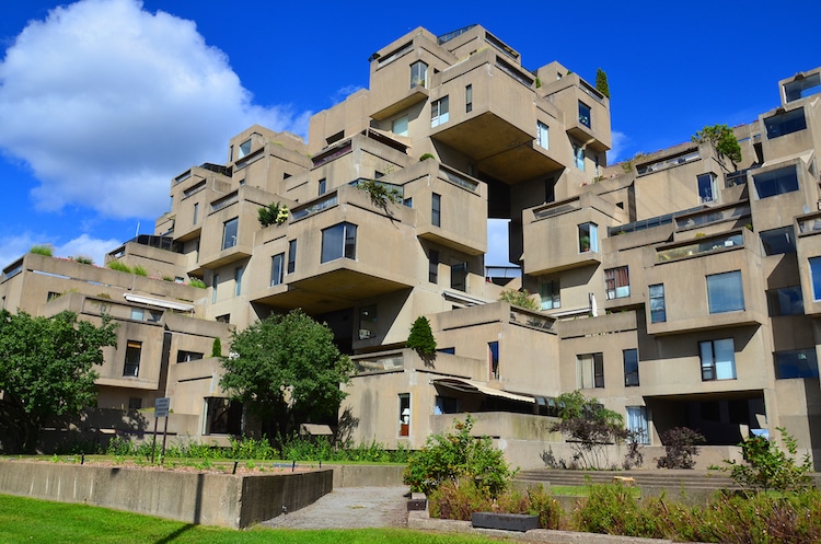
This is “Habitat 67”, located in Montreal, Canada. It is a community living complex desgined by Moshe Safdie. I think this piece of architecture is good design because it is extremely unique, innovative and efficient. The unit is comprised of 146 different apartment complexes ranging from one to eight concrete blocks in various combinations. This piece of architecture wows me because of its similarity in design to Legos. I am amazed by how Safdie was able to make some of the blocks appear to float without a structure underneath supporting them. This building could be good design to me and many others, because of its purpose in encapsulating suburban living with privacy and outdoor space while also conserving square footage. However, it may not represent good design to handicapped individuals, because when reading about this building I did not see that there were any elevators or handicap accessible entrances.
HABITAT 67 BY MOSHE SAFDIE. 1967, MONTREAL.
This building aligns with Deiter Ram’s criteria of what makes good architecture because of its minimalism and simplicity. The structure is made from simple tan concrete, which makes it essentially timeless as shifting trends come and go. I believe that this structure, as long as it stands, will never cease to amaze those who look at it. While this building is essentially timeless, it also encapsulates the trend of minimalism without purposefully doing so.
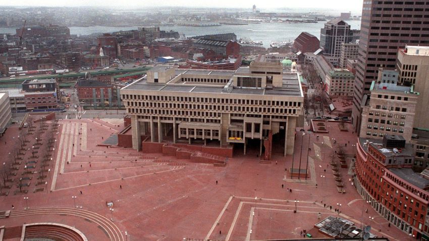
Boston City Hall was constructed during the Brutalist architectural movement in the 1960s. The Brutalist style of architecture became popular because it was a very different style of building that was supposed to open up Boston, not only physically due to its narrow streets, but economically after the 1950s. This building wows me because of how strange the bottom looks with no structural foundation, and how it is built into the red brick of the ground. I think this is good design because the City Council room and the Mayor’s office both project over the red brick plaza, encouraging more intimate public contact during celebrations and ceremonies that were held in the plaza. There is also ample room for foot traffic in and around the building because of the open space around the supporting columns and lack of foundation. I feel as though this building could encourage more public activity because of its placement and open room around the structure.
BOSTON CITY HALL, MICHAEL MCKINNEL AND GERHARD KALLMANN. 1968, BOSTON.
I feel as though this building would align with some of Dieter Ram’s criteria for good design. I do think it fits in with guideline #10, being a design with as little design as possible. This building does not include much decorative architectural aspects and looks as simple as possible, taking its use as City Hall into consideration. This design is also long-lasting, being made mostly of concrete and not needing many structural touch-ups as it ages. However, since this building was created during the Brutalist movement in the 1960s, it is interesting to think about if it is timeless or not. While it is very simplistic and minimal, made mostly of tan concrete, the style is very much characterized as Brutalist, which can make it appear aged as the years go on.
Interiors/Interior Design
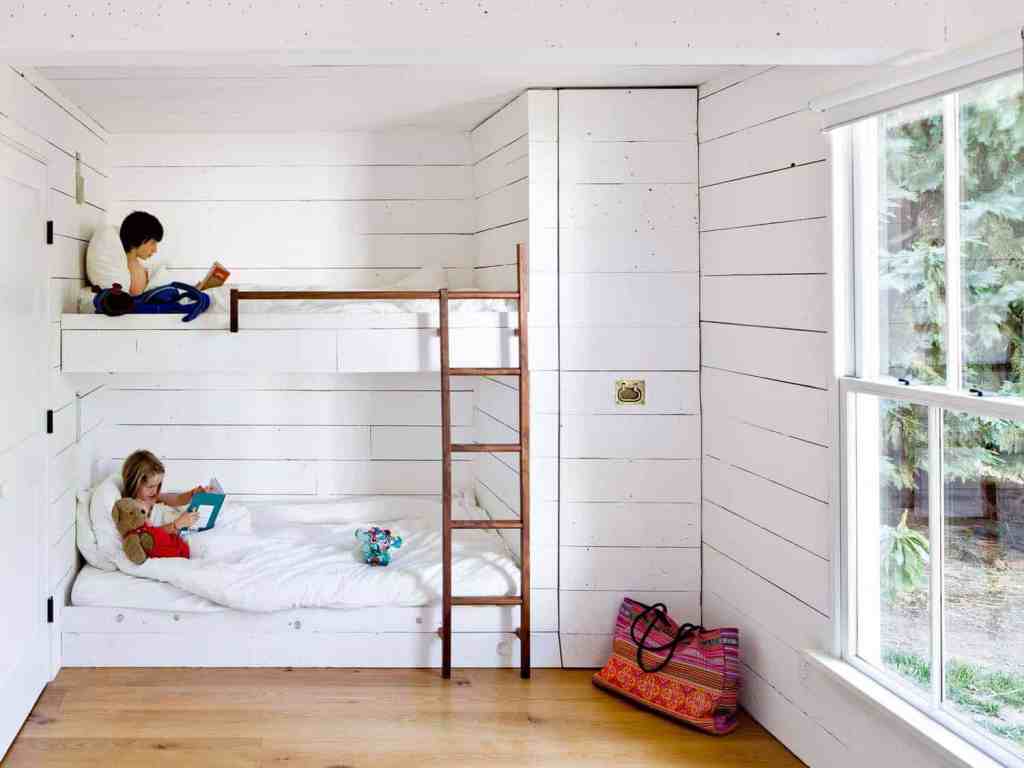
Jessica Helgerson bought a tiny home in Oregon in 2008 and decided to design the most effective and space-saving interior possible. The home is only 540 square feet, and Helgerson designed the interior with almost all recycled or re-purposed items. This children’s bedroom is exactly what I consider to be my personal design aesthetic; minimalistic with a vintage feel. I am wowed by the look of the white wood paneled walls because of their antiqued finish, and I love the pull out closet shown on the right of the bunk beds. I think that this room would represent good design to almost anyone who is trying to save space or be as compact with their living space as possible. I see a possibility with saving even more space in this room if there was a small attic in the ceiling to store the children’s toys, books etc. The possibilities are endless with being thrifty and saving space, and being even more environmentally friendly. I think that Helgerson did an incredible job on taking a tiny, closet-sized room and turning it into a functional and aesthetically pleasing children’s bedroom.
JESSICA HELGERSON, “TINY HOME” CHILDREN’S BEDROOM. 2008, OREGON.
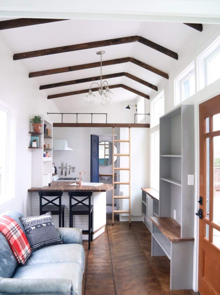
This is an interior of a “living area”, created by Matt Impola, founder of Handcrafted Movement. It includes a kitchen, living room and loft area. He began working on this small house as a “weekend project”, and has since found his love of decorated tiny spaces with environmentally friendly, recyclable, and extremely functional items. His trick for this room was in the flooring; he used one-inch thick ply wood to floor this home, leaving him a few extra inches of room for furnishing and extra items than if he used regular flooring. I think this is amazing design because he pays extreme attention to details that all influence how effective his use of space is. This interior wows me because of how gorgeous it is, and how everything in this space is reused and re-purposed. Similar to the other tiny home, this interior is good design to anyone who is trying to live a more minimalistic life and conserve space. However, the loft included in this space uses a ladder to access it, which would be a problem to handicapped individuals.
MATT IMPOLA, “SPACIAL CONSERVATION” LIVING AREA. ~2016, CALIFORNIA.
Both of these interior designs would align with Dieter Ram’s guidelines of good design. They are extremely innovative, taking a new approach on spacial conservation. They are both useful an aesthetically pleasing. Both are thought out to the last detail, whether it be Jessica’s pull out closet or Matt’s one inch floors. They are also very environmentally friendly, using recyclable and reused items to furnish and decorate.
Fashion

Costello and Tagliapietra’s New York Fashion Week Fall/Winter 2012 collection screams good design because of how their clothing was produced. The two designers use AirDye to create the colors and patterns on their clothing. AirDye is a sustainable and environmentally friendly technology that uses water-free dyeing, saving huge amounts of energy and water. This is amazing design because not only do the clothes look great, but they were produced using extremely eco-friendly technology. The fashion industry wastes incredible amounts of water and energy when producing items. This is good design to everyone because being environmentally conscious is something that impacts the entire world positively. This line of fashion also represents my personal design aesthetic because, fashion wise, it is very flowy, and 60s inspired. It also environmentally aligns with my personal design aesthetic because I love anything that is eco-friendly.
Costello Tagliapietra, NYFW Fall/Winter 2012, California.

“I AM NOT A VIRGIN” jeans started when founder Peter Heron realized that millions of tons of denim scraps and plastic bottles were tossed into landfills each year. He decided to create a brand that created clothes from fabric scraps and recycled bottles. I think that this is great design because it is extremely innovative and environmentally friendly. Recycling extra fabric from manufacturers and thrown away bottles and turning them into new clothes is an amazing idea. I see infinite possibilities in this brand, because if they are already using fabric scraps and bottles successfully, you can imagine all of the other recyclable materials that could come into play.
I AM NOT A VIRGIN/PETER HERON, BOTTLE RECYCLED JEANS. 2013, NEW YORK.
Both of these fashion examples align with Dieter Ram’s guidelines of good design. They are aesthetically pleasing, which is one of the most important aspects of fashion. They are extremely environmentally friendly, which is their main selling point. They are also long lasting, not in the way of the specific garment will last forever, but in the way that recycling goods is something that will last forever.
Graphic Design
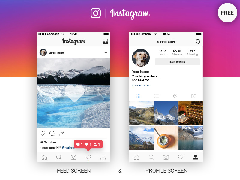
I chose the graphic design aspect of the app Instagram. The layout and design of Instagram puts the emphasis on the user instead of the app as a brand. Kevin Systrom’s design of the “like button”, the tabs on the bottom and the layout of the feed and profile are all essential aspects to why Instagram is so popular. The design is innovative because it was a brand new approach to social media that focused on photos. While the layout of the app has changed since the launch in 2010, the base features remain the same; the like button, the icons that represent the tabs, and the profile screen. This is good design because it encourages users to produce content, rather than only consume brand-created content. I think this is good design to everyone because anyone is able to create content on Instagram. The design aesthetic is simplistic and minimal, which aligns with my personal design preference.
Instagram, Kevin Systrom. 2010, USA.

The McDonald’s “M” logo was created by Jim Schindler in 1962. Since then, the slogan was coined, but the classic “M” logo has stayed the same. This is good design to me because it is timeless and recognizable. Even today in 2019, the simple “M” makes everyone worldwide think, “McDonald’s”. The design of this logo has made a huge impact on McDonald’s as a brand and people worldwide. I enjoy the design aesthetic because they are consistent with their color use of red and yellow, and it is very simple yet recognizable.
McDonald’s, Jim Schindler. 1962, USA.
Both of these examples of graphic design align with Dieter Ram’s guidelines of good design, but in different ways. Instagram is “as little design as possible”, not focusing on creating loud graphics for the brand, but focusing on being user-friendly and accessible. It also makes the product, Instagram, understandable, as its interface is very simple. McDonald’s use of graphic design is also simplistic, however the focus is on being long lasting. The logo is timeless and continues to be recognizable to this day. It is also honest. Ram says that good design should be honest and should not make a product seem more innovative or valuable than it really is. I think McDonald’s does a great job of this because its logo simply says, “I’m lovin’ it.” It is sold to the consumer at face value, simply saying, “our food is good.”
Product Design
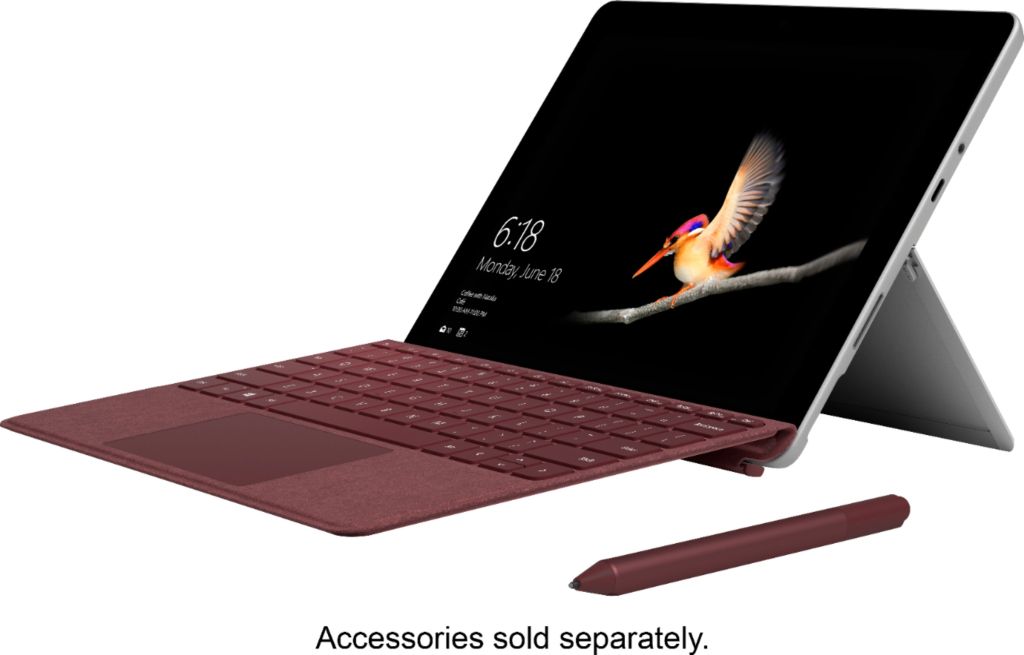
The Microsoft Surface represents good design to me because of its innovative design and user friendly features. The Surface includes a touch screen with a detachable keyboard, so it can be used as a laptop or as a tablet. It also includes a pressure-sensitive touch pen, which can be used instead of typing using a pop up box where you can write the words you want to type, and the computer translates them to typeface for you. I think that this is good design for everyone because there are features that are inclusive for any way you want to use the product. Braille keyboards, Sticky Keys, and voice-reading options are available for individuals with disabilities. This object wows me with how innovative and inclusive it is, creating a very simple and easy user-friendly product.
Microsoft Surface, Microsoft. 2012, Produced in Taiwan.

I think Fitbit is an amazing example of good design. Fitbit is a fitness bracelet that tracks things like your total steps, heart rate, breathing, etc. Fitbit is different than the rest of fitness trackers because it gives you personal reminders to get moving, calculates daily goals using your personal statistics, and gives on screen guided workouts. I think this is good design to everyone because it is customizable and caters to your personal needs. You can give it information such as height, weight, gender, personal goals, and even disabilities, which are all taken into account when creating your personal goals. It is also aesthetically pleasing because it is small and can be worn as a watch, and it does not get in your way of other daily activities.
Fitbit, James Park and Eric Friedman. 2007, California.
Both of these products align with Dieter Ram’s guidelines of good design. They are both aesthetically pleasing and easy to use. They are also both honest; they do not try to promise the consumer something that they cannot provide. They are thorough to the last detail, the Surface thinking about inclusivity and providing a user-friendly database, and the Fitbit thinking about customization and personalization.
 Alivia Leon